
The Psychology of Premium HVAC Websites: 3 Ideas That Make Homeowners Pick You
· Updated November 9, 2026

Founder, Honest HVAC Marketing Agency
Digital marketer since 2013. Runs every account himself.
Copies the link to this page
Honest HVAC Marketing Agency explains the psychology of premium HVAC websites through three ideas: the halo effect, cognitive load and micro interactions. A homeowner whose AC dies in July searches "HVAC near me," opens four tabs and, within seconds, picks a favorite without reading a word. They choose the company that feels safe and professional, and that feeling decides who gets the big install and who gets the cheap tune-up call. This guide is the written version of a video by Shaurya Jain, founder of Honest HVAC Marketing Agency, on how to make an HVAC website feel worth the price.
Key takeaways
- Your website has to feel safe and professional. Saying so in the copy is not enough.
- The top of your homepage, before anyone scrolls, shapes how visitors judge everything below it.
- Every extra button, link and popup makes the visitor work harder, and a visitor who works harder trusts you less.
- Small touches, like a button that responds and a form that confirms, tell visitors you care about details.
- Visitors remember the best moment and the last moment of a visit, so make the booking form the best part.
The halo effect: the first impression colors everything after it
The halo effect is how a first impression shapes every judgment that follows. Picture the nicest person you have ever met, dressed in a way you associate with trouble. Before they say a word, you have already decided they are probably not a good person. Nothing they say afterward fully erases that.
Websites work the same way. Research on first impressions of web pages puts the snap judgment at about 50 milliseconds, faster than a blink, and that judgment decides whether a visitor stays or leaves.
That makes the hero section, the top of your homepage before any scrolling, the most valuable space on your site. It is the part that sets the halo, positive or negative.
| What the visitor sees | What the visitor assumes | |
|---|---|---|
| Negative halo | A blurry stock photo, six phone numbers in the header and a pile of coupons | You may not be reliable, even if your crew is the best in town |
| Positive halo | A clean, professional image at the top and real photos of your team and your work | Great technicians and great work |
Premium brands do not just design a homepage. They plan the first impression they want the homeowner to have. For more on what to put near your call button, see our guide to HVAC website trust signals. Planning the first impression is the thinking behind our HVAC website design service, and our case studies show real client work.
Cognitive load and fluency: easier reads as better
Human brains are wired to save energy. Our ancestors did not have much food, so the brain learned to take the quickest, most efficient route to a decision. That wiring is still there today, even though food is easy to get.
A confusing page makes the brain work harder. That effort is cognitive load, and it feels stressful. A simple, clear page feels smooth. That is cognitive fluency. The brain reads "easy" as better, more trustworthy and higher quality, because easy is quicker to decode.
The less effort a visitor needs to figure out what to do on your site, the better it is for your business.
What a cluttered HVAC website looks like
- All services crammed into one block
- Three competing buttons and a popup at the same time
- A menu with 14 links
The visitor is already stressed, and the house is at 88 degrees. The site adds more stress at the worst moment.
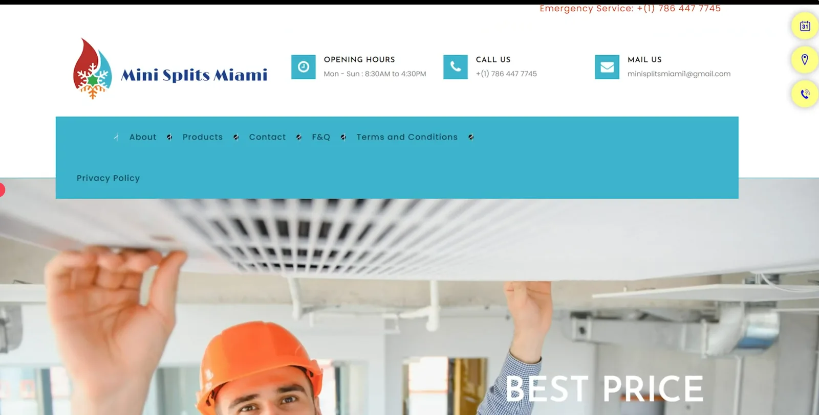
Here is what that looks like on a real HVAC homepage. The header repeats the same phone number, then adds opening hours and an email address. The menu spends two of its six slots on Terms and Conditions and Privacy Policy, and it wraps onto a second row. Three floating buttons sit on the right edge, and the hero puts the words "Best Price" over a generic photo.
What a premium HVAC website looks like
- Lots of white space, so the content can breathe
- The most important thing shown first on the homepage
- A short, simple, predictable menu
The visitor feels calm and in control right before they call.
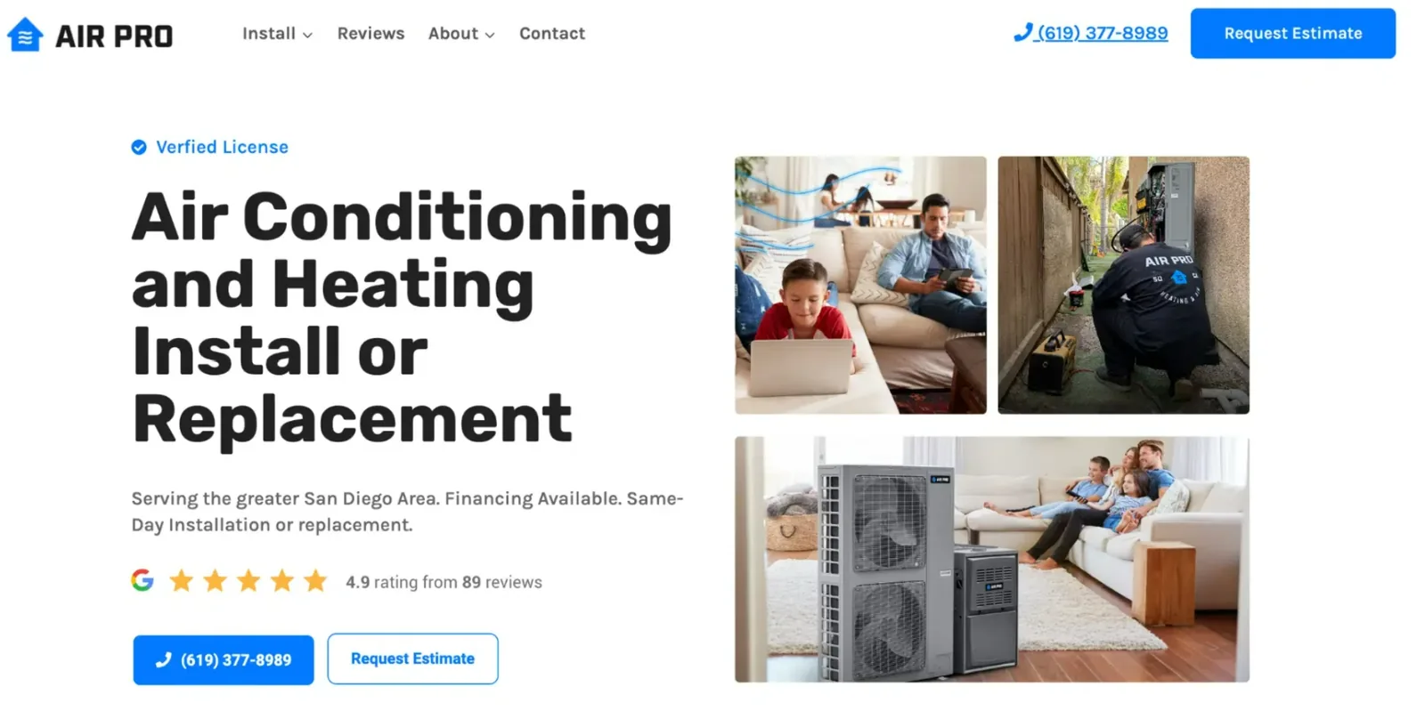
Here is a cleaner top of page. The menu has four items, and the header carries one phone number and one Request Estimate button. The headline says exactly what the company does. A license badge and a 4.9 rating from 89 Google reviews sit above the call buttons, and the photos include a technician in a branded uniform at work.
This is also one reason HVAC sites lose calls. We cover the other causes in why HVAC websites lose calls.
Micro interactions and the peak-end rule
Micro interactions are tiny touches: a button that shifts when you hover on it, a check mark on a form, a smooth scroll. The peak-end rule says people remember the best moment of an experience and the ending, not every moment in between. Think of a first date. Most people recall the highlight and how the night ended, not each minute.
Micro interactions create small peaks of positive feeling. A cheap site feels flat. A premium site feels alive, and that tells the visitor you care about them. Peaks plus ending equal memory.
Make the last click feel good
A website visit usually ends at the booking form or the call button. If that ending is smooth and reassuring, the whole visit feels good. If the form is clunky or throws an error, that is what the visitor remembers.
Here is a simple way to use this. Say someone fills in your form about an AC that is not working. When they submit, a short video pops up that says thank you for contacting us and that you will be in touch right away. Almost no HVAC company does this, so the visitor will remember it.
People also read small details as a sign of bigger ones. If you care about a button, they assume you care about their furnace. So test your form on your phone and on your desktop, and make sure everything works.
How top brands do it
Shaurya Jain points to a few brands that apply these ideas well:
- Apple: one big product shot and one bold headline on the homepage, with smooth scrolling and smooth menus. Nothing on the page is confusing.
- Luxury fashion brands: plenty of white space, which says "we are so confident we don't need to shout." Attention stays on the product.
- Stripe and Figma: clear, logical layouts that make complex products feel simple, which creates a halo of innovation and trust.
A website is not a brochure. It is an experience, and most HVAC companies ignore that.
A three-step plan you can start today
1. Plan the first impression
Focus on the top half of your homepage. Pick one thing you want the homeowner to feel: calm, trust or relief. Use real photos of your team and your work instead of stock photos. People want to see the real humans behind your brand, especially now that AI images are everywhere.
2. Remove clutter
On every page, ask what you can take out. Shorten the menu and add more white space. Give each section one job. Then test the site on someone who has never seen it: ask a friend to visit and tell you what they think the site wants them to do. If their answer is not what you intended, the page needs work.
3. Add small touches
Check your button hover states, page loading and scrolling. Polish the booking form most of all, because after calling you, the form is how people contact you.
The point is respect, not tricks
Every detail on your site is a chance to show you care. Respect their time by keeping things clear. Respect their intelligence by building something thoughtful. Respect their feelings with small moments that feel good. Do that, and people stop shopping on price.
Where a premium website fits in your marketing
A premium site only pays off when homeowners actually reach it. HVAC SEO puts your site in front of homeowners who are searching for HVAC help, and HVAC lead generation is the other way to get homeowners asking for work. The website is what they land on in both cases, so it has to make the right first impression.
If you want help applying this to your own site, see our HVAC website design service, read the case studies and client video testimonials, or book a call with Shaurya Jain. You can also read about our guarantee. For a longer look at what a high-performing site includes, read our guide to HVAC website features.